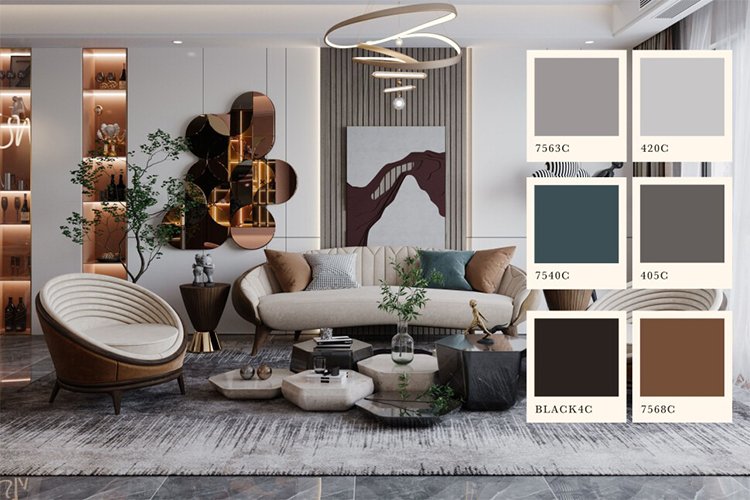
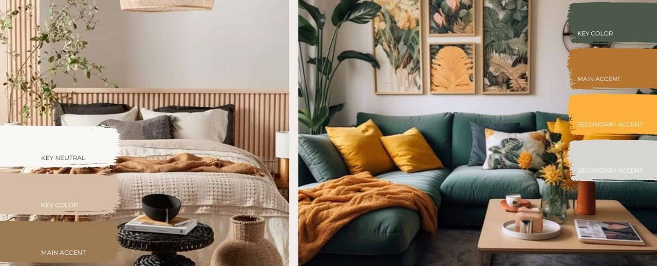
Color is one of the most powerful tools in interior design. It can set the mood, define the style of a room, and even make a room appear larger or smaller. Choosing the right colors for your home can sometimes be overwhelming, but with the right approach, you can create a color palette that will enhance your living space. In this blog, we’ll walk you through the process of using color in interior design and provide practical tips for choosing the perfect palette for any room.
1. Start with a neutral base
When choosing a color palette for your home, it’s a good idea to start with a neutral base. Neutral colors like white, beige, gray, and soft browns provide a clean and timeless foundation for the room. They help create a calm and balanced background that allows other colors to stand out.
How to Use Neutral Colors:
Use neutral tones for walls, larger pieces of furniture (like sofas or beds), and flooring. This will give the room a subtle, elegant feel.
Neutral colors are versatile and pair well with almost any accent color, so you can easily change the look of the room over time without having to repaint or buy new furniture.
Add texture to neutral rooms with fabrics like linen, wool, or leather to create depth and interest without using bold colors.
Starting with a neutral base gives you the flexibility to experiment with different accent colors while ensuring the room remains unified and calm.

2. Choose an accent color
Once you have a neutral base, it’s time to add some personality with accent colors. Accent colors are the shades you use to add energy and visual interest to the room. These can be bold tones or softer shades, depending on the mood you want to create.
How to choose accent colors:
Choose one or two accent colors that you like. You can choose bold, contrasting colors for a dramatic effect, or softer shades for a calmer atmosphere.
Consider what mood you want to create in the room. Warm colors like red, orange, and yellow create a cozy, inviting atmosphere, while cool colors like blue, green, and purple can promote relaxation and calm.
Use accent colors on smaller items like pillows, rugs, artwork, lamps, or curtains. These items can be easily swapped out if you want to change the color scheme later.
Remember that the goal of accent colors is to complement the neutral tones, not overwhelm them. A well-chosen accent color can add style and balance to the room.
3. Consider the function of the room
The purpose of the room can play a big role in determining the best color scheme. Different colors can affect our emotions and behavior, so it’s important to choose colors that fit the function of the room.
Here’s how to choose colors based on function:
Living room or family room: For these high-traffic areas where you gather with family or guests, consider using warm tones like beige, soft browns, or light grays with accents of blue, green, or even gold. These colors create a welcoming and comfortable atmosphere.
Bedroom: In a bedroom, soothing colors like soft blue, lavender, or pastel pink work well to create a peaceful environment that promotes relaxation and sleep. You can use darker shades for a cozier, more intimate atmosphere, but avoid colors that are too bright or garish that may disrupt your rest.
Kitchen: Kitchens benefit from fresh, vibrant colors like soft yellow, green, or even blue. These colors stimulate energy and appetite while creating a vibrant, inviting space for cooking and socializing.
Home office: For a productive workspace, consider using neutral tones with accents of blue or green. Blue is known to improve concentration, while green promotes a sense of balance and calm.
Considering the purpose of the room will help you choose colors that not only enhance the decor but also support the intended function of the room.

4. Consider lighting
Lighting plays a big role in how colors work in a room. Natural light, artificial light, and the orientation of your room all affect how colors look on your walls and furniture.
Here’s how to use lighting to your advantage:
Design rooms withNorth-facing windows tend to have cooler, more subdued light, so you’ll want to use warm colors to balance the space and make it feel cozier.
South-facing rooms get plenty of natural light and often work well with cool tones like blues and greens, which won’t seem too cold in these bright spaces.
For rooms with artificial lighting, consider what type of lightbulb you use. Warm bulbs will enhance warmer tones like yellow and orange, while cooler bulbs will accentuate blues and greens more.
Before finalizing your color choices, test them in the room at different times of the day. Paint color swatches on the wall or place colorful fabrics near the windows to see how the colors change in different light.
5. Use the 60-30-10 rule
A helpful rule to follow when creating a balanced color palette for your space is the 60-30-10 rule. This rule will help you distribute colors in a way that looks balanced and harmonious.
Here’s how the 60-30-10 rule works:
60% of the room should be the dominant color (usually the neutral base color like white, beige, or gray). This color should cover the walls, large furniture, and the floor.
30% of the room should be the secondary color, which can be a richer or deeper tone used for accent furniture, curtains, or rugs.
10% of the room should be the accent color, which can be used for accessories like pillows, vases, and artwork.
By following this rule, you can create a room where colors are evenly distributed and no one color overpowers the others.

6. Experiment with color combinations
Don’t be afraid to experiment with different color combinations to find what works best for your space. There are several tried-and-true color schemes that can help you make your decision.
Popular color schemes:
Monochromatic: This color scheme uses variations of a single color. It’s perfect for creating a calm, cohesive look.
Complementary: Complementary colors are opposite each other on the color wheel, like blue and orange or red and green. This scheme creates a high-contrast, vibrant effect.
Analogous: These colors are next to each other on the color wheel, like blue, teal, and green. This scheme offers harmony and subtle contrast.
Triadic: A triadic color scheme uses three colors evenly spaced on the color wheel, like red, yellow, and blue. This creates a dynamic, balanced look.
By trying different combinations, you can find a palette that suits your style and the mood you want to create.
7. Don't overcrowd the room
While it’s fun to play with color, it’s important not to overwhelm the room with too many bold tones. Too many contrasting colors or loud patterns can make a room feel chaotic and uncomfortable.
How to avoid overcrowding the room:
Stick to a few main colors and use them wisely throughout the room. You can still add interest by incorporating texture and pattern, but limit the number of colors you use.
If you use a bold color like a deep red or navy blue, balance it with lighter shades so the room doesn’t feel too heavy.
Be aware of the size of the room. Lighter colors can make a small room seem larger, while darker colors can make a spacious room feel more intimate.
Final Thoughts
Color is a powerful tool that can transform any room. By choosing your color palette wisely and considering factors such as the function of the room, lighting and overall mood, you can create a harmonious, inviting environment. Whether you prefer soft neutrals, bold contrasts or calm pastels, the right colors can enhance your interior design and give your living space a pleasant atmosphere.
Don’t be afraid to experiment with color and have fun – it’s your home and the possibilities are endless!

